
Noodle Time
Cooked to the perfection, timing is crucial in the world of culinary arts. Based on this concept of precision and fresh ingredients, we want to introduce a new dynamic and energetic new look for our latest Noodle Time franchise.
MT DRUITT WESTFIELD, NSW
2018

Using the process of cooking as a form generator, vibrant colours are used to illustrate the myriad of fresh ingredients used, it also communicates the excitement of mixing ingredients together to invent new ideas and dishes, much like an experiment.


The name of the shop gave a presupposition to the design trajectory of the shop. Our design was to communicate a futuristic noodle laboratory where the traditional, authentic aromas of the past can meet with the present day to experiment and create new innovative flavours.
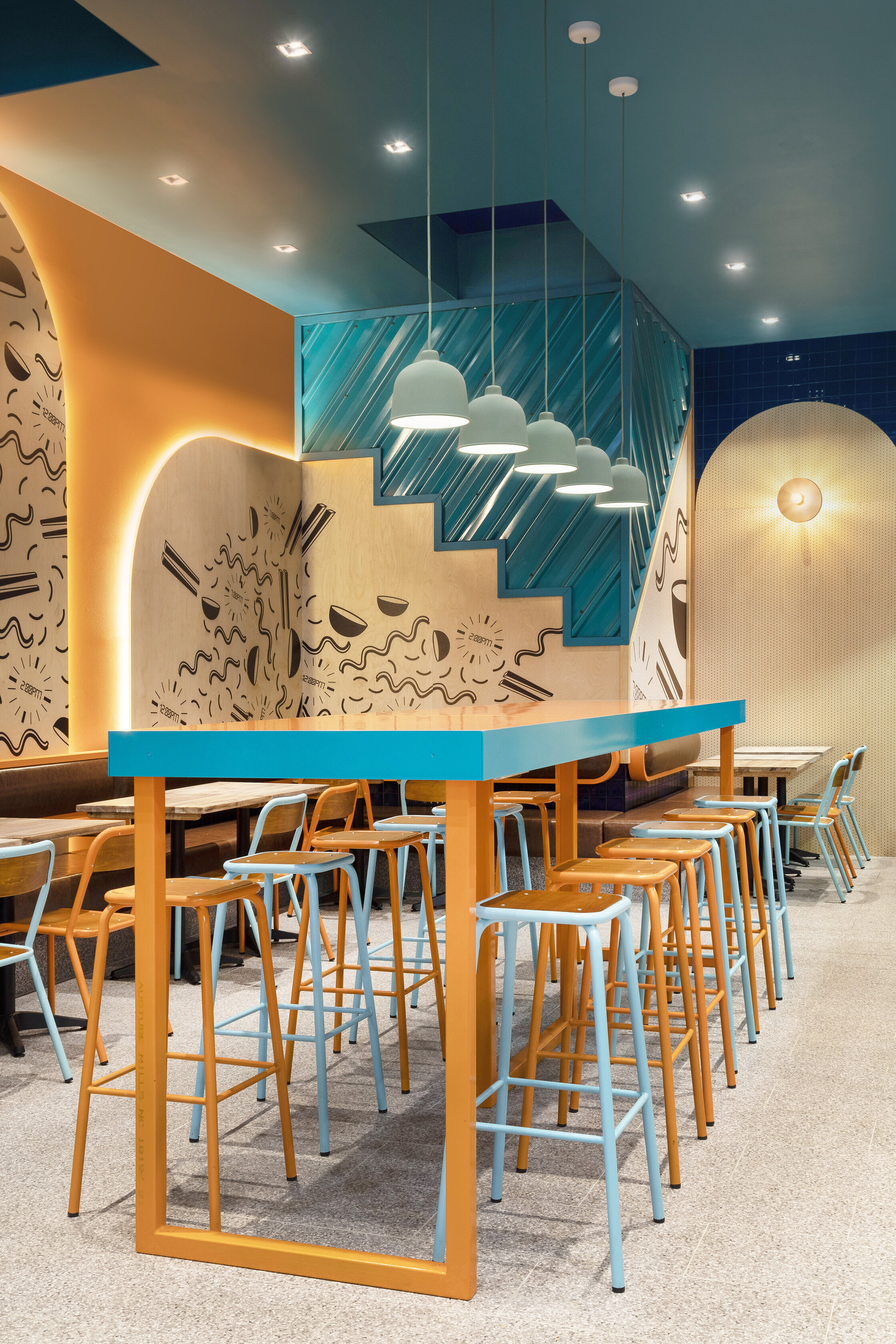


The timeless design of Noodle Time uses colour to represent the nature of cooking noodles and their delicious ingredients. Warm colours were used to convey the heat needed to cook noodle, while the cooler colours of green represent the fresh vegetables and blue to represent seafood ingredients. The overall design steps outside the generic and traditional noodle shop design by using daring forms, bold colours, a vast selection of materials, fun graphics and neon lights.

